Object-Oriented Programming with Java, part I + II

This material is licensed under the Creative Commons BY-NC-SA license, which means that you can use it and distribute it freely so long as you do not erase the names of the original authors. If you make changes in the material and want to distribute this altered version of the material, you have to license it with a similar free license. The use of the material for commercial use is prohibited without a separate agreement.
Authors: Arto Hellas, Matti Luukkainen
Translators to English: Emilia Hjelm, Alex H. Virtanen, Matti Luukkainen, Virpi Sumu, Birunthan Mohanathas, Etiënne Goossens
Extra material added by: Etiënne Goossens, Maurice Snoeren, Johan Talboom
Adapted for Informatica by: Ruud Hermans
The course is maintained by Technische Informatica Breda
Other basic components
In other chapters we have seen some basic JavaFX controls such as Button, Label and TextField. There are many more basic UI controls. In this chapter we will explain a few of them.
RadioButtons
A RadioButton is a button that can be selected or not selected. The RadioButton cannot be “deselected” once it’s selected. To deselect it, select another radiobutton in the same radiobutton group
You create a RadioButton using its constructor. Here is a RadioButton instantiation example:
RadioButton teacherRadioButton = new RadioButton("Teacher");
The String passed as parameter to the RadioButton constructor is displayed next to the RadioButton.
To make a RadioButton visible you must add it to the scene graph of your application. This means adding the RadioButton to a Scene, or as child of a layout which is attached to a Scene object.
Here is an example that attaches a RadioButton to the scene:
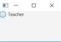
public void start(Stage stage) {
    RadioButton teacherRadioButton = new RadioButton("Teacher");

    HBox hbox = new HBox(teacherRadioButton);

    Scene scene = new Scene(hbox, 200, 100);
    stage.setScene(scene);
    stage.show();
}
The application resulting from running this example looks like this:
The RadioButton class has a method named isSelected which lets you determine if the RadioButton is selected or not. The isSelected method returns a boolean with the value true if the RadioButton is selected, and false if not. Here is an example:
boolean isSelected = teacherRadioButton.isSelected();
Combining RadioButtons in groups
Radio buttons are typically used in a group to present several mutually exclusive options. Groups are defined by using the object ToggleGroup from the JavaFX library. When ToggleGroup is used, only one radio button inside the group can be selected.
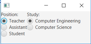
In the example above we create two groups of RadioButtons in order to have two inputs. The following code is used
public void start(Stage stage) {

    // Position section
    ToggleGroup positionToggleGroup = new ToggleGroup();
    Label positionLabel = new Label("Position:");

    RadioButton teacherRB = new RadioButton("Teacher");
    teacherRB.setToggleGroup(positionToggleGroup);
    teacherRB.setSelected(true);

    RadioButton assistantRB = new RadioButton("Assistant");
    assistantRB.setToggleGroup(positionToggleGroup);

    RadioButton studentRB = new RadioButton("Student");
    studentRB.setToggleGroup(positionToggleGroup);

    VBox positionVBox = new VBox();
    positionVBox.getChildren().addAll(positionLabel, teacherRB, assistantRB, studentRB);

    // Study section
    ToggleGroup studyToggleGroup = new ToggleGroup();
    Label studyLabel = new Label("Study:");

    RadioButton compEngRB = new RadioButton("Computer Engineering");
    compEngRB.setToggleGroup(studyToggleGroup);
    compEngRB.setSelected(true);

    RadioButton computerScienceRB = new RadioButton("Computer Science");
    computerScienceRB.setToggleGroup(studyToggleGroup);

    VBox studyVBox = new VBox();
    studyVBox.getChildren().addAll(studyLabel, compEngRB, computerScienceRB);

    // Add everything towards the UI
    BorderPane borderPane = new BorderPane();
    HBox hBox = new HBox();
    hBox.getChildren().addAll(positionVBox, studyVBox);
    borderPane.setCenter(hBox);

    Scene firstScene = new Scene(borderPane);
    stage.setScene(firstScene);
    stage.show();
}
The application resulting from running this example looks like this:
The selected radio button can be found by using the method isSelected on the object RadioButton, which returns a Boolean value, or the selected object RadioButton can be found using the method getSelectedToggle on the object ToggleGroup. If no RadioButton is selected the getSelectedToggle method returns null .
RadioButton selectedGroup = (RadioButton)studyToggleGroup.getSelectedToggle();
System.out.println(selectedGroup.getText());
It’s also possible to add EventHandler to see if the selection is changed like in the example below, which displays a pop-up when Computer Engineering is selected.
compEngRB.setOnAction(e -> {
    if (compEngRB.isSelected()) {
        new Alert(Alert.AlertType.INFORMATION, "TI 4 all!", ButtonType.OK).show();
    }
});
But sometimes it is more convenient to create an EventHandler on the ToggleGroup. This allows you to only create one EventHandler for the ToggleGroup. You can implement it using the following code
studyToggleGroup.selectedToggleProperty().addListener(
                (ov, old_toggle, new_toggle) -> {
                    if (studyToggleGroup.getSelectedToggle() != null) {
                        String text = ((RadioButton)studyToggleGroup.getSelectedToggle()).getText();
                    }
                });
Exercise gui-extra-1 Calculator
In this exercise you will create a GUI calculator using RadioButtons. The end result of the program looks like this:
gui-extra-1.1 Create the GUI
The first step is to create a semilair GUI as shown the image above. On the left side of the screen add two
TextFields with labels in front of it. On the right side of the screen add 4 RadioButtons with the text: Addition, Substraction, Multiplication and Divisiongui-extra-1.2 Implement the functionality
The next step is to implement the functionality to our calculator. When the user changes the selection of the
RadioButtons the program should calculate the result of number1 (operator from checkbox) number2

17.2. CheckBoxes
A CheckBox is a button which can be in two different states: Selected and not selected. The CheckBox control is represented by the class javafx.scene.control.CheckBox.
You create a CheckBox control via the CheckBox constructor. Here is a CheckBox instantiation example:
CheckBox greenCheckBox = new CheckBox("Green");
The String passed to the CheckBox constructor is displayed next to the CheckBox control.
To make a CheckBox control visible you must add it to the scene graph of your application. That means adding the CheckBox control to a Scene object, or to some layout component which is itself added to a Scene object.
Here is an example showing how to add a CheckBox to the scene graph:
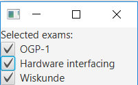
public void start(Stage stage) {

    // Checkboxes
    Label examLabel = new Label("Selected exams:");
    CheckBox ogp1CheckBox = new CheckBox("OGP-1");
    CheckBox hwiCheckbox = new CheckBox("Hardware interfacing");
    CheckBox wiskundeCheckBox = new CheckBox("Wiskunde");

    VBox selectedCourse = new VBox();
    selectedCourse.getChildren().addAll(examLabel, ogp1CheckBox, hwiCheckbox, wiskundeCheckBox);

    Scene firstScene = new Scene(selectedCourse);
    stage.setScene(firstScene);
    stage.show();
}
The application resulting from running this code looks like this:
The method isSelected can be used to check if the Checkbox is selected. It’s also possible to add EventHandler to see if the selection is changed like in the example below
wiskundeCheckBox.setOnAction(e -> {
    if (wiskundeCheckBox.isSelected()) {
        new Alert(Alert.AlertType.INFORMATION, "Math 4 all!", ButtonType.OK).show();
    }
});